
Fit different training contexts
Help users find home or gym workouts aligned with their goals and available equipment.
Search the native WordPress menu, then use the complete directory for every long-tail capability.
A WORKOUT COMPANION FOR EVERYDAY LIFE.
Make finding your next workout feel simple.
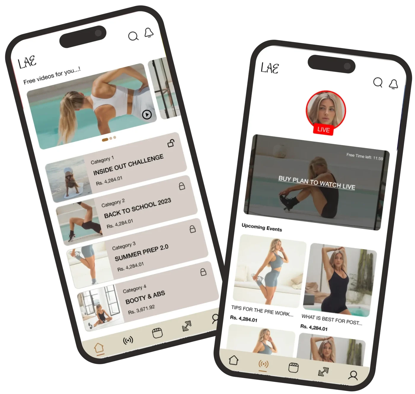
LAE Fitness brings workout discovery, exercise videos and live trainer sessions into a dedicated mobile experience. Capermint’s published design work focused on helping people find relevant training and move confidently from browsing to a workout.
The App Store listing is verified. The current app has evolved since the original design project shown here; no Google Play listing was verified.
THE PROJECT
People approach fitness with different goals, schedules and equipment. A useful workout app needs to help them find a suitable session without turning that choice into another task. LAE Fitness brought workout plans, instructional videos and personalized training guidance into a mobile companion for both home and gym use.
Capermint’s documented role spans user surveys and research, personas, information architecture, wireframes, visual design, prototyping and testing. The design connects content discovery, premium access, live sessions and a personal workout area.
The original brief also recognized the business behind the experience: maintaining varied content, working with qualified trainers, encouraging paid access and keeping users engaged. This case follows the published design response to those needs.
Help users find home or gym workouts aligned with their goals and available equipment.
Organize categories, exercise videos and live sessions into clear paths through the app.
Distinguish available and locked content, and show the relevant workout information before an unlock action.
PRODUCT VISUALS
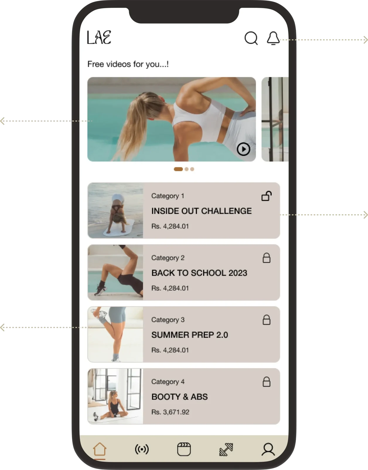
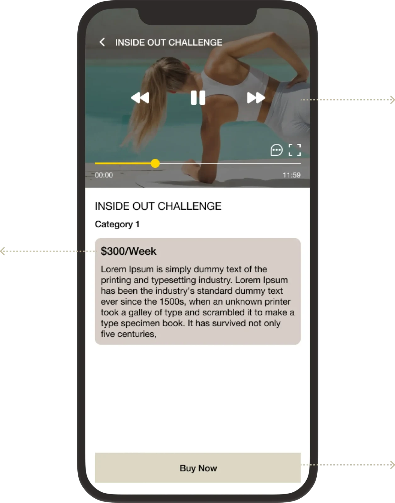
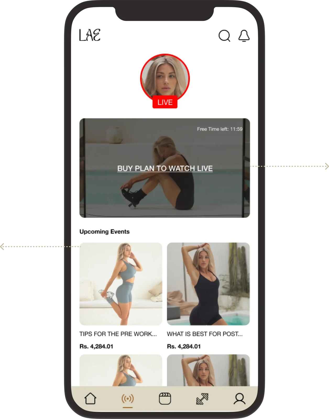
Original interface mockups from Capermint’s LAE Fitness case study. Labels, content and prices inside the artwork are historical design examples, not current offers. Select an image to view it in detail.
THE EXPERIENCE
The original design gives each stage a distinct purpose, from finding a relevant workout to returning to the user’s own training activity.
Open the home screen for suggested videos or browse categories to explore the available workout content.
Use the video-detail screen to review the exercise content and access information before choosing a workout.
Follow an exercise video or explore upcoming live sessions with trainers, depending on the desired experience.
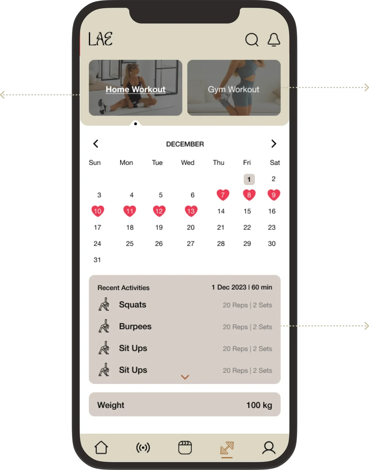
Use the personal workout area to switch between home and gym routines and review recent activity.
CHALLENGES & SOLUTIONS
The published brief identifies content quality, engagement, monetization and personalization as business challenges. The interface responses below are grounded in the documented screens and UX process.
THE CHALLENGE
A single undifferentiated feed cannot clearly address people training at home and people using gym equipment.
THE RESPONSE
Organize the personal workout area around home and gym contexts, supported by workout categories and suggested exercise content.
Why it mattersUsers have a clearer starting point for finding training suited to their situation.
THE CHALLENGE
Workouts, instructional videos and live sessions need to remain discoverable as the offer grows.
THE RESPONSE
Use category browsing, home-screen suggestions, search and dedicated video-detail views to separate discovery from deeper inspection.
Why it mattersThe design gives new content a place within the existing navigation structure.
THE CHALLENGE
Users need to understand what they can open immediately and what requires a purchase.
THE RESPONSE
Show locked and unlocked categories, then present access and price information with the purchase action on the relevant detail screen.
Why it mattersThe purchase decision follows information about the workout instead of appearing without context.
THE CHALLENGE
A useful fitness experience needs paths back to training beyond the initial browse.
THE RESPONSE
Bring upcoming live events, workout suggestions and recent activity into the design, giving users several ways to resume participation.
Why it mattersThe interface supports repeat use without claiming a measured improvement in retention.
THE CHALLENGE
A broad feature brief can become difficult to navigate unless it is tested against real user needs.
THE RESPONSE
Use surveys, research, personas and information architecture to shape wireframes, then develop prototypes and conduct usability testing.
Why it mattersThe published process connects user understanding to interface decisions and evaluation.
PRODUCT FEATURES
The home screen presents video suggestions and entry points into the workout library.
Category browsing organizes the available training content and distinguishes locked from accessible options.
Video demonstrations, workout information and purchase actions appear in a dedicated detail view.
A live area introduces upcoming sessions and trainer-led workout content.
My Workout separates the two training contexts so users can return to the appropriate routines.
A calendar and activity history give the personal workout area a view of previous participation.
RESEARCH & DESIGN PROCESS
Capermint’s published role is a UX and visual-design engagement, from understanding users through prototypes and usability testing. The case does not specify an engineering stack.
Use surveys, interviews, research, personas and a competitive audit to identify user needs, pain points and the core product direction.
Develop information architecture, user flows, paper wireframes and digital low-fidelity layouts to organize content and tasks.
Translate the selected structure into high-fidelity screens, visual design and a prototype covering the main workout journeys.
Test the experience for usability. The published case lists testing as part of the process but does not provide participant counts, task scores or measured improvements.
DESIGN & USABILITY
Warm neutral colors, exercise imagery and a clear typographic hierarchy give the original product an approachable fitness identity.
The published palette combines beige and soft gray with black and a brown accent, keeping interface controls distinct from the workout imagery.
The original design specifies Helvetica Neue with different weights for headings, labels and body text. Workout names and access information have clear roles within each screen.
Discovery, video details, live sessions and personal activity each have a focused layout, supported by recurring navigation at the bottom of the app.
OUTCOMES & IMPACT
The published work documents a cohesive mobile design that brings training content, access decisions and personal activity into a single experience.
Home suggestions, categories and detail screens create a path from browsing to a selected workout.
Home routines, gym routines, recorded videos and live sessions are represented within the product design.
The original screens share typography, neutral colors and familiar navigation across the main app journeys.
These are documented design outcomes, not measured fitness or commercial results. The current App Store listing describes later product changes; those changes are not attributed to this original Capermint engagement.
PROJECT QUESTIONS
LAE Fitness is a mobile fitness companion. The original project combines workout plans, exercise videos, home and gym training, live trainer sessions and personal workout activity.
The published case lists user surveys, research, personas, information architecture, wireframes, visual design, prototyping and testing.
The original screens distinguish locked and accessible categories and show exercise details, pricing information and an unlock action in the video-detail journey.
A verified LAE – Fitness App listing is available on Apple’s App Store and is linked on this page. A matching Google Play listing was not verified.
Not necessarily. These images document Capermint’s original project. The current App Store listing describes an evolved app, so the live interface and available features may differ.